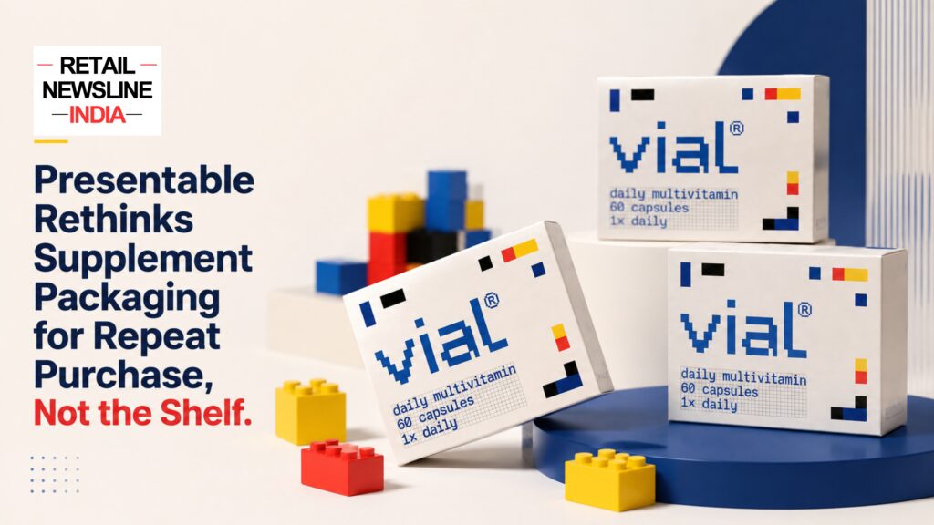
Gurugram-based design studio Presentable has developed vial, a multivitamin identity and packaging system that rethinks how wellness products can communicate in an increasingly digital, repeat-purchase market. Rather than designing primarily for the first few seconds of a shelf encounter, vial treats packaging as part of the consumer’s everyday wellness routine — an object that is repeatedly handled, viewed, tracked and shared.
The project positions daily nutrition around consistency rather than correction, using a modular grid, nutrient-led colour coding, restrained typography and integrated daily-use checkboxes.
Presentable describes vial as a daily multivitamin concept built around the belief that wellbeing is something people maintain rather than something they fix. Its official case study says the system treats daily nutrition as an integrated ritual and uses a structured visual language instead of urgency-led supplement branding.
The project has also attracted coverage across design, branding and packaging publications including The Dieline, Pentawards, Packaging of the World, Branding in Asia, Campaign Brief Asia, Retail Design Blog and WhatPackaging, among others.
Presentable’s vial: Rethinking How Supplement Packaging Works
Traditional supplement packaging often borrows from pharmaceutical design — clinical typography, strong claims, saturated colours and visual cues intended to communicate efficacy or urgency.
Presentable takes a different approach with vial.
The studio’s concept starts from a simple proposition: wellness is built through consistency over time.
Instead of presenting a multivitamin as something consumers turn to when something is missing or wrong, vial frames daily nutrition as a routine. The packaging therefore becomes less of a promotional surface and more of a system designed to support repeated interaction.
Presentable’s official case study describes vial as a packaging and identity system that prioritises “consistency over intervention”, positioning nutrition as part of an everyday ritual.
From Shelf Packaging to an Everyday Interface
One of the central ideas behind vial is that the role of packaging is changing.
For many consumer products, the traditional packaging environment was the physical retail shelf. The design had to attract attention quickly and communicate the product proposition in a short interaction.
But wellness products are increasingly discovered and purchased through digital commerce, social media, quick-commerce platforms and creator-led content.
That changes what packaging has to do.
A consumer may encounter a supplement online before purchasing it. Once purchased, the package can remain visible for weeks, appearing repeatedly in morning routines, product photographs, videos, social posts and other forms of content.
For a daily multivitamin, the physical package is therefore repeatedly encountered after the purchase decision, not just before it.
This is where vial’s design strategy becomes particularly relevant: the pack is treated as an object that participates in the consumer’s routine rather than simply a container.
A Modular Grid Forms the Core of vial’s Identity
The central visual device in vial is a modular grid.
Geometric blocks represent individual nutrients, with each unit remaining distinct while contributing to a larger composition.
Presentable’s case study explains that the system uses a rational grid across composition, colour, typography and the logotype itself. This creates a common design logic rather than treating the logo and packaging as separate visual elements.
The concept also draws on the compositional clarity associated with Piet Mondrian and the modular stacking logic of Tetris. Packaging of the World describes the system as using repeating blocks to represent individual nutrients working together over time.
The result is a visual identity where the structure itself communicates the product philosophy.
Each Block Represents a Nutrient
Rather than using colour simply to attract attention, vial assigns a functional role to colour.
Each colour block represents an individual nutrient.
The blocks remain recognisable individually while becoming part of a larger visual composition.
This creates a visual metaphor for the way multiple nutrients contribute to an overall daily nutritional routine.
The approach also allows colour to become an information layer rather than simply a marketing device.
The Logotype and Packaging Share One Design Logic
Another defining feature of vial is the relationship between its logo and packaging system.
Rather than applying a logo to an independently designed package, Presentable developed the identity and packaging from the same modular structure.
The studio states that the grid informs composition, colour, typography and the logotype, allowing the visual identity to emerge from a unified system. (Presentable)
This makes the brand mark feel like a natural extension of the packaging rather than an additional graphic element.
Checkboxes Turn the Packaging into a Daily Routine Tool
Perhaps the most functional element of the vial packaging system is the integration of daily checkboxes.
The box includes a checkbox system that allows users to mark their daily dose directly on the packaging.
This transforms the pack from a passive container into a small behavioural interface.
The concept is straightforward:
Take the daily dose → mark the checkbox → repeat.
That interaction reinforces the central brand philosophy of consistency.
Packaging and user behaviour therefore become connected through the same visual system.
Industry coverage of the project has highlighted this feature as one of the ways vial turns packaging into an element of the daily wellness ritual.
Packaging Designed for Repeat Use, Not Just First Purchase
The vial project challenges a common assumption in consumer packaging: that the most important moment is when a customer first sees the product.
For a daily-use multivitamin, the relationship continues for weeks.
The package is opened repeatedly, placed on desks or shelves, picked up during daily routines and potentially shown in photographs or videos.
This creates a different design opportunity.
Instead of asking only:
“How do we make someone buy this?”
the system considers:
“How do we make the product meaningful after someone has bought it?”
That distinction is central to Presentable’s approach.
The studio’s case study frames vial as a system designed around everyday use and consistency rather than an intervention-led supplement proposition. (Presentable)
When Packaging Becomes Part of Brand Content
Another important dimension of vial is its potential role in content.
Wellness products increasingly appear in:
- Morning-routine videos
- Social media posts
- Creator content
- Founder stories
- Product photography
- Unboxing content
- E-commerce imagery
- Wellness and lifestyle campaigns
When the packaging itself contains a clear visual system, it can become part of the communication.
The modular grid gives creators and brands multiple elements to talk about — the meaning behind the colours, the nutrient blocks, the structure of the grid and the daily tracking mechanism.
Recent coverage of the project has specifically discussed the potential of packaging to become part of brand storytelling and content rather than functioning only as a physical container.
Presentable Brings Modernist Design into Wellness Packaging
The visual language of vial is rooted in order, repetition and structure.
Presentable connects these principles to modernist design while adapting them for contemporary wellness.
The project draws from Mondrian’s grid-based compositions and the modular logic of Tetris, while also connecting its functional philosophy to India’s history of purpose-led design. Coverage of the project references the 1958 India Report by Charles and Ray Eames and its emphasis on designing everyday objects around function and purpose. (Brand to Watch)
This thinking can be summarised through four principles:
Structure creates clarity.
Colour carries information.
Repetition represents consistency.
Function gives every element a reason to exist.
Why vial Is Relevant to the Future of Wellness Packaging
The wellness and supplements category is becoming increasingly visual.
Consumers can discover products through search, social media, influencers, marketplaces and quick-commerce platforms before they ever encounter them physically.
That creates a more complex packaging journey.
The package has to work:
- Before purchase — as a recognisable brand asset.
- At purchase — as a clear product identity.
- After purchase — as part of everyday use.
- During repeat purchase — as a recognition and habit cue.
- In content — as a visible part of the brand story.
vial addresses these stages through one integrated identity system rather than treating packaging as a single-use marketing surface.
Presentable: Gurugram-Based Design Studio
Presentable is a strategy-led brand identity and design studio based in Gurugram, Haryana.
According to its official website, the studio was established in 2022 and works across brand strategy, visual identity, packaging, digital experiences, retail and spatial design. Its work spans lifestyle and consumer categories alongside celebration design.
Presentable’s packaging practice covers areas including label design, surface graphics, packaging systems, production-ready artwork and unboxing experiences. The studio says its packaging work serves sectors including wellness, beauty, fashion, food and beverage, home and living, jewellery, hospitality and retail.
Presentable — Official Website
vial Gains International Design and Packaging Coverage
The vial project has been featured across a growing range of design and branding publications.
Coverage identified for the project includes:
- Packaging of the World
- The Dieline
- Pentawards
- Branding in Asia
- Campaign Brief Asia
- Retail Design Blog
- WhatPackaging
- World Brand Design Society
- Packaging-focused and design industry platforms
Presentable’s own features page lists vial among its internationally featured work. Packaging of the World published the project in January 2026, describing it as a conceptual multivitamin packaging project.
Campaign Brief Asia subsequently covered the project in August 2026, highlighting its modular identity, restrained typography and use of colour as an information tool.
Key Highlights of Presentable’s vial Packaging System
Design ElementRole in the vial SystemModular gridCreates the structural foundation of the identityColour blocksRepresent individual nutrientsLogotypeBuilt from the same modular design logicRestrained typographySupports clarity and hierarchyDaily checkboxesAllow users to track daily intakeRepeat-use packagingDesigned around continued interaction after purchaseContent-friendly identityAllows the pack to become part of campaigns and social contentModernist referencesDraws on modular composition and functional design principles
The Bigger Packaging Design Shift
Presentable’s vial project reflects a broader shift in how brands can think about packaging in a digital-first consumer environment.
Packaging no longer exists only in the physical retail aisle.
It can appear in a product listing, Instagram Reel, unboxing video, influencer routine, founder story, quick-commerce screen, customer photograph and repeat-purchase moment.
For categories such as wellness, beauty, skincare and personal care — where habit and repeat use are particularly important — this makes packaging a continuing brand touchpoint.
vial takes that idea literally.
Its packaging is designed not just to be seen, but to be used, interacted with, understood and remembered.
Conclusion
Presentable’s vial is an example of packaging design moving beyond shelf appeal toward a more continuous relationship between product, identity and consumer behaviour.
Its modular grid turns nutrients into a visual system. Its colour coding makes information part of the identity. Its logotype follows the same structural logic. And its printed checkboxes bring the brand philosophy of consistency directly into everyday use.
The result is a multivitamin packaging concept that treats the pack as more than a container — it becomes part of the wellness routine and part of the brand story.
For an industry increasingly shaped by digital discovery, repeat purchases and social content, vial demonstrates how packaging can continue communicating long after the initial purchase decision has been made.
Frequently Asked Questions
What is vial by Presentable?
vial is a conceptual daily multivitamin identity and packaging system developed by Gurugram-based design studio Presentable. It is designed around the idea that wellness is maintained through consistency rather than treated as a corrective intervention.
Who designed the vial multivitamin packaging?
The vial identity and packaging system was designed by Presentable, an independent design studio based in Gurugram, India.
What is the main idea behind vial packaging?
The central idea is to frame daily nutrition as a consistent wellness ritual rather than a corrective health intervention. The packaging uses structure, repetition and interaction to reinforce that idea.
What does the modular grid represent in vial?
The modular grid forms the core of the visual identity, with individual geometric units representing nutrients that work together as part of a larger whole.
What do the colours represent in vial packaging?
Each colour block represents an individual nutrient. Colour is therefore used as an information and navigation tool rather than simply as a decorative or promotional element. What are the checkboxes on vial packaging for?
The printed checkboxes allow users to track their daily intake directly on the package, turning the box into an interactive part of the daily routine.
Is vial a real multivitamin product or a design concept?
Available project documentation describes vial as a conceptual multivitamin packaging and identity project developed by Presentable. Packaging of the World explicitly categorises it as a conceptual project.
Where is Presentable based?
Presentable is based in Gurugram, Haryana, India, and works with clients in India and internationally.
Where has Presentable’s vial project been featured?
The project has received coverage across design and packaging platforms including Packaging of the World, Branding in Asia, Campaign Brief Asia, Retail Design Blog, The Dieline and Pentawards, among others.